



A RETURN IS NOT THE END OF THE CUSTOMER JOURNEY
Design Every Step from Eligibility to Refund Confirmation
A WooCommerce returns user experience is tested when a customer already has a problem. The product may not fit, may arrive damaged or may simply be different from what the buyer expected. At that moment, decorative reassurance is less valuable than a clear answer: whether the order is eligible, what must happen next, how long each stage normally takes and where help is available if the standard path does not work.
StudioDDC treats returns as a service journey that crosses the account area, email, warehouse, payment method and support team. The interface cannot compensate for an unclear policy, and a generous policy cannot help when customers cannot find it. Begin by mapping the real operational process, including exceptions, before choosing a plugin or adding a return button to the order screen.
Make Eligibility Understandable before a Request Starts
Present the essential policy near the purchase decision and link to the complete version. Use plain language for deadlines, product condition, exclusions, return shipping, exchanges and refund timing. Avoid hiding a material condition in a dense legal page. The order view should interpret the policy for that purchase, showing the relevant dates and items instead of asking the customer to calculate eligibility.
A request form should identify the order securely, allow the correct item and quantity to be selected and collect only information needed for the next decision. Reason choices can use controlled options for reporting, but include a concise free-text field where context matters. If photographs are required for damage, explain acceptable formats, size limits, privacy implications and what the evidence will be used for.
Reduce Effort without Removing Operational Controls
Self-service does not mean removing human judgement. It means allowing routine requests to progress without unnecessary messages while routing exceptions to a person. WooCommerce can support refunds from the order administration, and extensions may add return requests or customer-initiated flows. Whichever mechanism is chosen, permissions, payment-gateway behaviour and duplicate submissions need deliberate testing.
Communicate Status at the Moments Customers Actually Worry
Confirmation must describe the next action, not merely announce that a form was sent. Provide a reference, the expected review time and instructions for labels, packaging or drop-off. Send the same information by email, but keep the account page as the durable source of status. Customers should not need to search an inbox to discover whether a parcel was received or a refund was approved.
Measure the Complete Journey Instead of the Form Alone
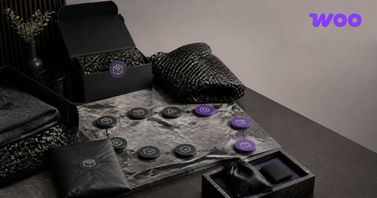
Use a small set of honest states such as requested, awaiting information, authorized, in transit, received, inspected, refund initiated and completed. Each status should have a customer-facing explanation and an internal owner. Do not expose warehouse jargon or imply that money is available when only an instruction has reached the payment provider. Explain that bank processing time may follow the store action.
Communicate Status at the Moments Customers Actually Worry
Accessibility matters because a return often involves urgency or frustration. Labels must remain visible, validation should identify the field and remedy, and status must not depend on colour alone. Test keyboard navigation, zoom, screen readers and mobile uploads. A printable label needs an accessible alternative, and support contact information should not disappear behind a chatbot when the automated path fails.
Measure more than return rate. Track time to first decision, completion rate, repeated contacts, reasons, approval consistency, refund delay and the share of requests that require manual correction. Segment carefully by product and fulfilment method. A high return rate can reveal product information or quality problems; it is not automatically evidence that the returns interface is too easy.
Measure the Complete Journey Instead of the Form Alone
Review messages, policy and operational data together. Improve product pages when sizing or imagery creates avoidable returns, and improve fulfilment when damage clusters around a carrier or package. A reliable WooCommerce returns user experience protects trust because it makes responsibility visible, keeps promises realistic and gives both customers and staff a dependable record of what happens next.
Professional context: DidacSoria.com.
FREQUENTLY ASKED QUESTIONS
Practical Questions about WooCommerce Returns User Experience
Should every WooCommerce return be automatic?
No. Routine eligible requests can be streamlined, while high-value, damaged, customized or ambiguous cases may require documented human review.
When should the return policy be shown?
Summarize material conditions before purchase and provide the full policy through a clear, stable link. Repeat order-specific eligibility in the customer account.
What is the most useful returns metric?
No single metric is sufficient. Combine completion, decision time, repeated contacts, refund delay and product-level reasons to understand the whole journey.
Build a System That Can Be Reviewed and Improved
StudioDDC connects strategy, content, design and technical review in a documented workflow built for long-term use.
Continue with a Clear Next Step
Explore the StudioDDC portfolio or discuss a focused project when the method needs to become a working digital experience.









 A Local WordPress Development Workflow for Safer Website Changes
Leave a Reply