Visit the Dark Silent Hill Zone Website Experience
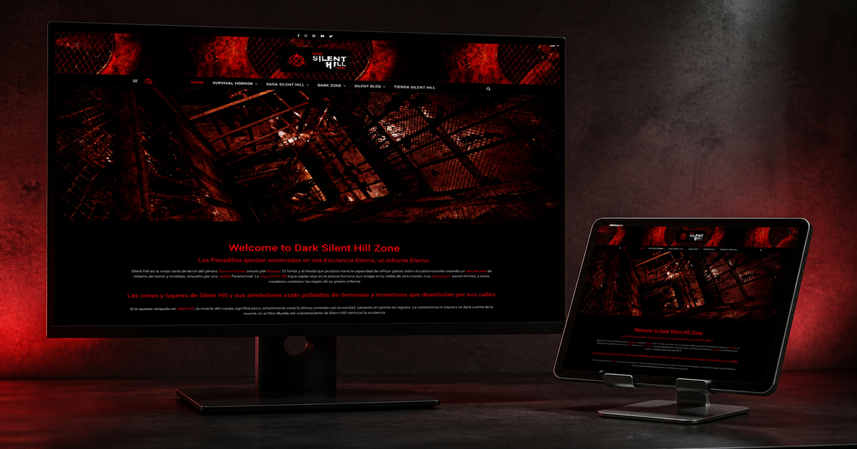
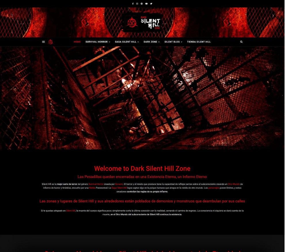
Dark Silent Hill Zone is built as an immersive fan archive about the locations, dimensions, stories and recurring themes associated with Silent Hill. The interface does not try to neutralise that subject. Instead, it uses darkness, red illumination and industrial imagery to place the reader inside a recognisable atmosphere before the longer articles begin.
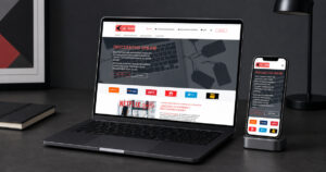
The original project image is shown here inside the content, while the new featured image remains in its normal theme position above the article.
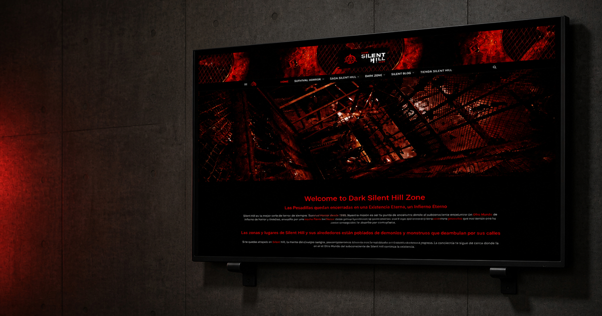
A Horror Interface Can Be Immersive Without Losing Clarity
The mounted display separates atmosphere from navigation. Strong contrast, measured red accents and a stable editorial hierarchy help fan content remain readable without making unverified claims about any brand or franchise.
Project Perspective
A Horror Website Design Case Study Built Around Real Content
Horror Website Design is useful only when the visual system explains the subject, helps people move through the content and gives every action a clear reason to exist.
Atmosphere can easily damage readability. The important design decision is to reserve the strongest texture for banners and transitions, then place longer explanations on controlled dark surfaces with enough contrast, width and spacing.
The Design Brief
Turning a Broad Subject into a Deliberate User Journey
Black, deep red and distressed industrial imagery build recognition; clean typographic zones keep the experience usable.
Lore hubs, thematic archives, a blog and shop route create several depths of engagement without forcing every visitor through the same sequence.
The intended audience is: Fans exploring lore, chronology, characters and related media through a visual archive.
Make the subject recognisable in the first screen.
Keep navigation clear as the content archive grows.
Separate editorial context from commercial actions.
Preserve a coherent mobile reading order.
Design Decisions
Three Systems That Keep the Experience Coherent
01
Visual Hierarchy
Black, deep red and distressed industrial imagery build recognition; clean typographic zones keep the experience usable.
02
Content Architecture
Lore hubs, thematic archives, a blog and shop route create several depths of engagement without forcing every visitor through the same sequence.
03
Responsive Behaviour
Columns collapse into a deliberate mobile sequence, with headings, images and calls to action kept in a logical reading order.
SEO, Performance and Trust
Preparing Dark Silent Hill Zone for Sustainable Search Visibility
Descriptive archive pages and internal links can organise a large fictional universe, while titles should distinguish analysis, chronology and opinion instead of repeating the franchise name alone.
A search-ready Horror Website Design does not come from forcing the keyphrase into every paragraph. It comes from a descriptive title and URL, a clear heading hierarchy, useful supporting language, image metadata, internal links and a page that loads reliably on mobile.
The content should connect naturally to StudioDDC Insights, relevant project pages and the project enquiry route. External references are used selectively and marked nofollow when they lead to third-party destinations.
This is an independent fan-oriented design case study. It does not claim affiliation with Konami or other rights holders, and all referenced properties remain with their owners.
Practical Review
A Focused Checklist Before Publication
Confirm one H1 and descriptive H2 sections.
Review every image URL and alternative text.
Test mobile spacing, contrast and keyboard order.
Check affiliate or trademark disclosures where relevant.
Frequently Asked Questions
Questions about the Horror Website Design Project
What was the main goal of the Dark Silent Hill Zone redesign?
To make horror website content easier to recognise, browse and maintain while preserving a visual identity appropriate to the subject.
How does the layout support mobile visitors?
The main sections use a predictable reading order, generous touch targets and content modules that can stack without losing hierarchy or context.
What makes this project useful for SEO?
The strategy combines a focused keyphrase, project-specific vocabulary, clear headings, internal links, honest disclaimers and enough original explanation to satisfy a real research intent.
Start a Web Design Project
Need a Horror Website Design Adapted to Your Own Brand?
StudioDDC can turn a complex subject into a clear, maintainable and responsive WordPress experience shaped around your audience, content and business priorities.
Web Developer and Graphic Designer at StudioDDC, focused on WordPress, SEO, Ecommerce, Performance Optimization and high-quality Digital Experiences with a strategic approach.







 SpykPress: Digital Magazine Web Design