OfficeHome is an editorial and affiliate resource for people planning a functional workspace at home. It covers furniture, stationery, accessories and technology, but its strongest organising idea is not the product list: it is the promise of turning an available corner into a focused place to work.
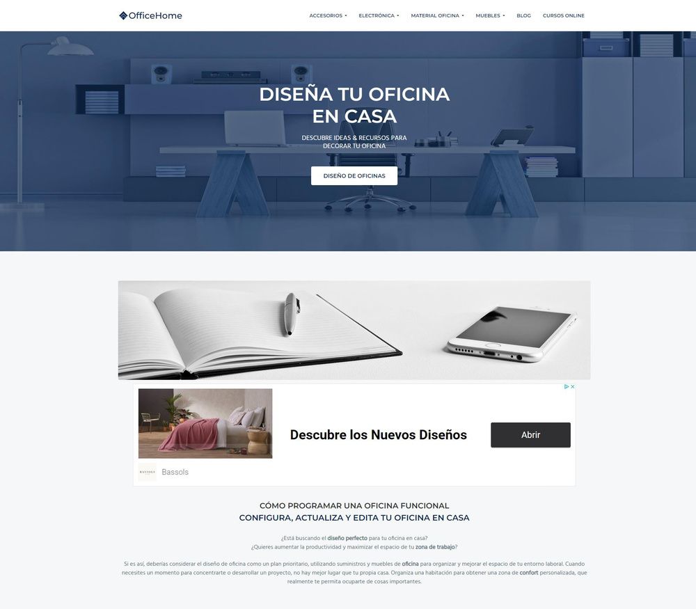
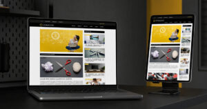
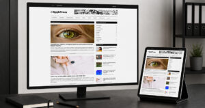
The original project image is shown here inside the content, while the new featured image remains in its normal theme position above the article.
A Practical Interface for Planning a Better Home Office
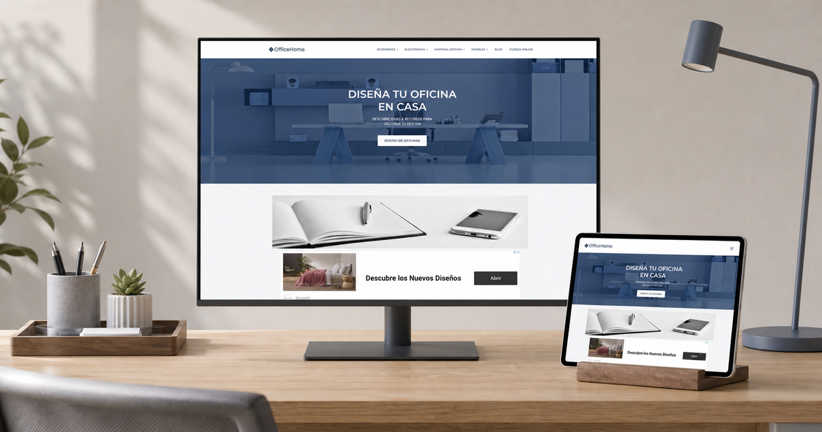
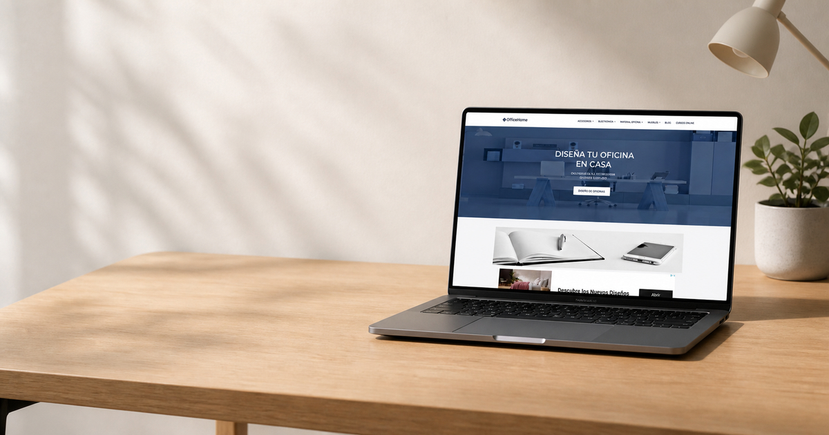
The laptop presentation places OfficeHome in the environment its content addresses. The page hierarchy can connect planning advice, product resources and room inspiration without turning every section into a sales message.
Project Perspective
A Home Office Website Design Case Study Built Around Real Content
Home Office Website Design is useful only when the visual system explains the subject, helps people move through the content and gives every action a clear reason to exist.
The design has to serve inspiration and practical comparison at the same time. Large lifestyle sections create aspiration, whereas percentages, checklists and product modules translate that mood into decisions about space, lighting, storage and equipment.
The Design Brief
Turning a Broad Subject into a Deliberate User Journey
Cool blue overlays, architectural photography and measured typography give the site a planning-led tone rather than a catalogue-only appearance.
Planning guidance leads into room ideas, then supporting categories and products. That order helps commercial links feel like practical resources rather than interruptions.
The intended audience is: Remote workers and students adapting small or shared rooms into productive work areas.
Make the subject recognisable in the first screen.
Keep navigation clear as the content archive grows.
Separate editorial context from commercial actions.
Preserve a coherent mobile reading order.
Design Decisions
Three Systems That Keep the Experience Coherent
01
Visual Hierarchy
Cool blue overlays, architectural photography and measured typography give the site a planning-led tone rather than a catalogue-only appearance.
02
Content Architecture
Planning guidance leads into room ideas, then supporting categories and products. That order helps commercial links feel like practical resources rather than interruptions.
03
Responsive Behaviour
Columns collapse into a deliberate mobile sequence, with headings, images and calls to action kept in a logical reading order.
SEO, Performance and Trust
Preparing OfficeHome.es for Sustainable Search Visibility
Long-form guides can answer specific questions about small spaces, lighting or ergonomics, while internal links connect those questions to carefully selected resources.
A search-ready Home Office Website Design does not come from forcing the keyphrase into every paragraph. It comes from a descriptive title and URL, a clear heading hierarchy, useful supporting language, image metadata, internal links and a page that loads reliably on mobile.
The content should connect naturally to StudioDDC Insights, relevant project pages and the project enquiry route. External references are used selectively and marked nofollow when they lead to third-party destinations.
Product references, prices and affiliate destinations may change. The case study discusses the website design and does not endorse a specific item.
Practical Review
A Focused Checklist Before Publication
Confirm one H1 and descriptive H2 sections.
Review every image URL and alternative text.
Test mobile spacing, contrast and keyboard order.
Check affiliate or trademark disclosures where relevant.
Frequently Asked Questions
Questions about the Home Office Website Design Project
What was the main goal of the OfficeHome.es redesign?
To make home office content easier to recognise, browse and maintain while preserving a visual identity appropriate to the subject.
How does the layout support mobile visitors?
The main sections use a predictable reading order, generous touch targets and content modules that can stack without losing hierarchy or context.
What makes this project useful for SEO?
The strategy combines a focused keyphrase, project-specific vocabulary, clear headings, internal links, honest disclaimers and enough original explanation to satisfy a real research intent.
Start a Web Design Project
Need a Home Office Website Design Adapted to Your Own Brand?
StudioDDC can turn a complex subject into a clear, maintainable and responsive WordPress experience shaped around your audience, content and business priorities.
Web Developer and Graphic Designer at StudioDDC, focused on WordPress, SEO, Ecommerce, Performance Optimization and high-quality Digital Experiences with a strategic approach.









 Refined Pro: Lifestyle WordPress Theme