Custom Logo Design: Build a Mark that Works Beyond the Brief
Home » Blog » Graphic Design » Custom Logo Design: Build a Mark that Works Beyond the Brief
| Didac Soria
StudioDDC Portfolio Reference
See Logo Decisions in a Real Project
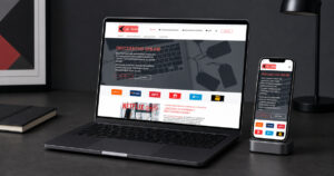
This article uses the FINE ASIP logo study as a visual reference. The project is presented respectfully as evidence of layout, hierarchy and production decisions; it does not disclose private business information or make claims about the organisation behind the design.
Custom Logo Design: Build a Mark that Works Beyond the Brief
A strong custom logo design project begins with the decision the audience needs to make. StudioDDC approaches logo as communication: the work must attract attention, organise meaning and remain practical after the presentation has ended.
For new companies, evolving organisations and brands replacing improvised visuals, the goal is a recognisable logo with a practical life beyond a presentation board. That requires editorial judgement, technical preparation and a visual system strong enough to work in ordinary use, not only in a polished mockup.
Strategic Foundation
What Custom Logo Design Must Achieve
The format may be familiar, but the communication problem is specific. Before choosing colour or type, the project needs a defined audience, an honest offer and a hierarchy based on real questions. This prevents visual polish from hiding missing information.
StudioDDC uses the brief to decide what deserves emphasis, what can remain quiet and what should be removed. The resulting design feels considered because every visible choice supports the same purpose: a recognisable logo with a practical life beyond a presentation board.
Questions the Brief Must Answer
Who needs this material and in which situation?
What should the person understand first?
Which proof makes the message credible?
How will the asset be produced and maintained?
Three Working Principles
A Stronger Approach to Logo
01
Start with Meaning
A useful symbol grows from the offer, audience and personality rather than an arbitrary visual trend.
02
Test the Silhouette
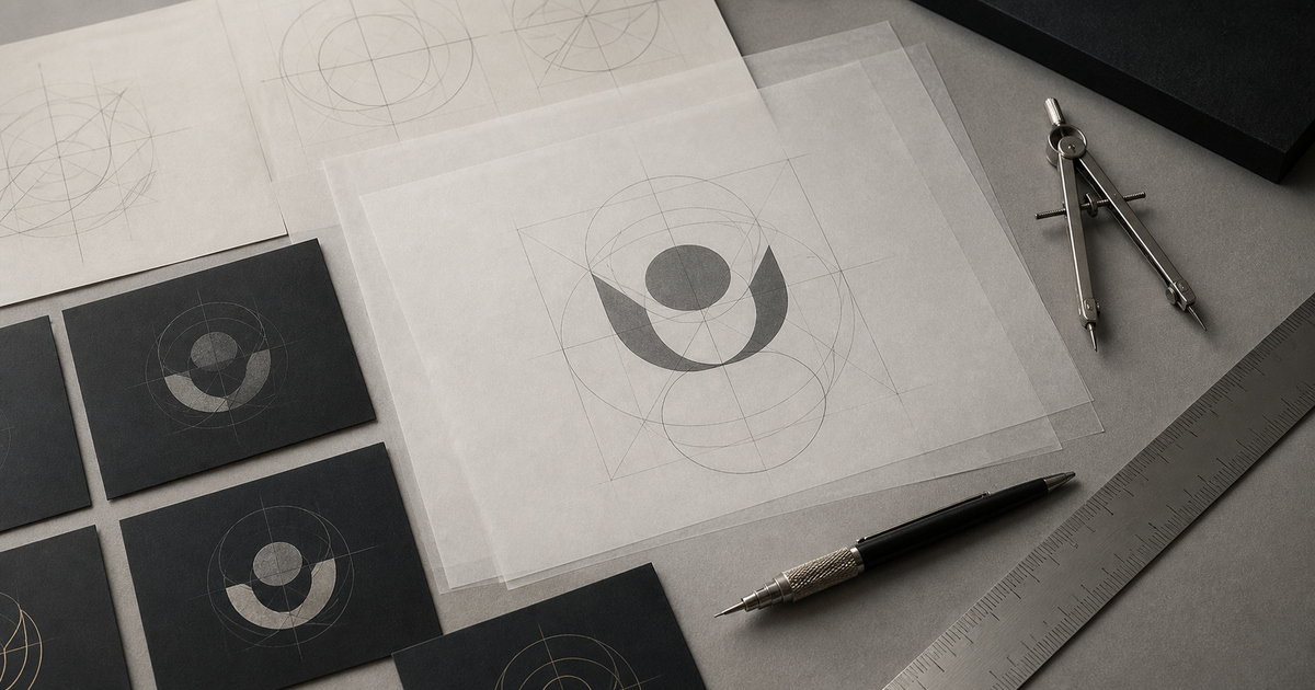
The mark should remain identifiable in one colour and at a small size.
03
Design a Family
Primary, compact and monochrome variants prevent inconsistent reinvention.
From Concept to Working Asset
Design Logo in the Context Where It Will Be Used
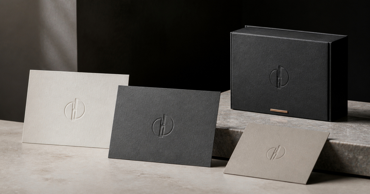
A mockup is useful when it exposes scale, handling, viewing distance or screen behaviour. It should not be used to disguise weak content. StudioDDC reviews the composition both in isolation and in context, then returns to the source file to correct the hierarchy rather than retouching the presentation.
The portfolio reference demonstrates how visual material can support a broader system. Names and commercial details are not the focus; the useful lesson lies in spacing, contrast, information order and the relationship between the design and its physical or digital format.
A Practical Workflow
Four Stages for Better Logo
A reliable process reduces subjective debate by connecting each review to a specific decision. The stages below are deliberately simple, but each one should produce evidence before the next begins.
01
Write A Concise Strategic Brief
At this stage, the practical task is to write a concise strategic brief. The review should test whether it supports a recognisable logo with a practical life beyond a presentation board, then record the approved decision for later production.
02
Map Relevant And Overused Visual Codes
At this stage, the practical task is to map relevant and overused visual codes. The review should test whether it supports a recognisable logo with a practical life beyond a presentation board, then record the approved decision for later production.
03
Develop Distinct Vector Directions
At this stage, the practical task is to develop distinct vector directions. The review should test whether it supports a recognisable logo with a practical life beyond a presentation board, then record the approved decision for later production.
04
Test The Selected Mark In Demanding Applications
At this stage, the practical task is to test the selected mark in demanding applications. The review should test whether it supports a recognisable logo with a practical life beyond a presentation board, then record the approved decision for later production.
Production and Quality Control
Details that Protect the Final Logo
Design quality is not finished when the layout looks balanced. Files, linked images, type licences, colour values, output dimensions and naming conventions all affect whether another person can reproduce the work accurately. For print, the production specification must be confirmed with the provider; for digital formats, responsive crops and export sizes need their own checks.
The most expensive mistakes are often ordinary: information that was never verified, a format that was never tested or a production requirement discovered too late. A calm final review should be separate from the creative presentation.
Copying Category ClichéS
Judging Only A Large Colour Version
Depending On Effects
Ignoring Clear Space
Delivering One Rigid File
Practical Questions
Logo FAQ
What makes a custom logo different from a template?
For new companies, evolving organisations and brands replacing improvised visuals, this question should be answered in relation to a recognisable logo with a practical life beyond a presentation board. A useful symbol grows from the offer, audience and personality rather than an arbitrary visual trend. The decision is tested during write a concise strategic brief before final approval.
How many logo concepts are useful?
For new companies, evolving organisations and brands replacing improvised visuals, this question should be answered in relation to a recognisable logo with a practical life beyond a presentation board. The mark should remain identifiable in one colour and at a small size. The decision is tested during map relevant and overused visual codes before final approval.
Which logo files should a company receive?
For new companies, evolving organisations and brands replacing improvised visuals, this question should be answered in relation to a recognisable logo with a practical life beyond a presentation board. Primary, compact and monochrome variants prevent inconsistent reinvention. The decision is tested during develop distinct vector directions before final approval.
Design for Real Use
Need Logo that Works Beyond the Mockup?
StudioDDC combines visual judgement, clear content structure and production care to create brand materials that remain useful after launch.
If the identity still needs definition, continue through the Graphic Design portfolio and compare how different formats carry the same brand logic. If the visual system is ready but the website is not, review the Web Design service before producing disconnected digital assets.
For broader planning, the StudioDDC blog connects design, WordPress, content and performance. Use it to prepare a more precise brief rather than collecting unrelated inspiration.






 Professional Business Card Design: Make Every Introduction Count