Editorial Web Design Inspiration: Turning Reading into an Experience
Home » Blog » SEO & Content » Editorial Web Design Inspiration: Turning Reading into an Experience
| Didac Soria
PRACTICAL IDEAS
Editorial Web Design Inspiration: Turning Reading into an Experience
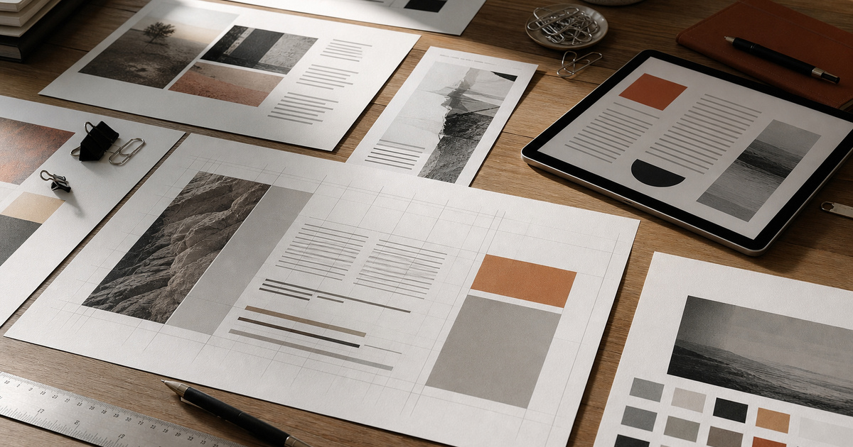
Editorial thinking gives digital content pace, emphasis and a reason to keep reading. The lesson is not to make a website resemble a magazine, but to direct attention with proportion, sequencing and purposeful interruption.
At StudioDDC, editorial web design inspiration is treated as a way to reduce uncertainty, protect quality and connect every decision to a real need. Aesthetics matter, but they work harder when they also improve reading, maintenance and the team’s ability to explain why the result takes this form. The goal is not to accumulate options, but to build a standard that can be used during briefing, production, review and publishing. Each choice then has context, and the result can evolve without losing coherence.
The difference usually appears when real material enters the project. A long heading, a differently cropped photograph, a person navigating by keyboard or a colleague retrieving a file months later will test every decision. That is why this approach is reviewed beyond the perfect mockup: with complete content, narrow screens, error states and a clear maintenance route. Recording what the team learns prevents the next project from starting at zero and allows the original intention to survive without depending on somebody remembering a conversation. It also improves estimates, clarifies boundaries with clients and separates personal preference from a problem that affects the user. Repeated blocks are useful only when the material is genuinely repeated. Essays, case studies and resources deserve structures that reflect how each is read.
Three Decisions That Improve the Result
01
Plan the reading route
A page needs an entry point, a developing argument and useful exits. Headings and media should reveal that route before decorative decisions begin.
02
Use contrast with restraint
Scale, weight, width and whitespace can distinguish voices without filling the interface with boxes. Reserve the strongest contrast for genuinely important moments.
03
Let content shape modules
Repeated blocks are useful only when the material is genuinely repeated. Essays, case studies and resources deserve structures that reflect how each is read.
From Concept to a Repeatable Method
Editorial thinking gives digital content pace, emphasis and a reason to keep reading. The lesson is not to make a website resemble a magazine, but to direct attention with proportion, sequencing and purposeful interruption. A page needs an entry point, a developing argument and useful exits. Headings and media should reveal that route before decorative decisions begin.
Scale, weight, width and whitespace can distinguish voices without filling the interface with boxes. Reserve the strongest contrast for genuinely important moments. Repeated blocks are useful only when the material is genuinely repeated. Essays, case studies and resources deserve structures that reflect how each is read.
What to Avoid
Centering every paragraph for visual symmetry.
Using oversized headlines without a clear hierarchy.
Breaking text into cards that interrupt reading.
Copying print conventions that fail on small screens.
The aim is not to impose a recipe, but to remove predictable errors so considered decisions have room to work.
A Practical Five-Step Process
Outline the argument before choosing a grid.
Identify the dominant story and supporting material.
Set line length and type scale using real copy.
Place images where they add evidence or rhythm.
Review the page at mobile and desktop reading distances.
This order makes the work reviewable without depending only on impressions. Each step leaves evidence that can be discussed, corrected and reused in the next project.
Frequently Asked Questions
Is editorial design only for publishers?
No. Service pages and portfolios benefit when complex information is paced like a considered story.
How many fonts should an editorial website use?
Often one family with a useful range, or a carefully tested pair. Hierarchy depends more on disciplined roles than quantity.
Does asymmetry harm usability?
Not when reading order remains clear. Asymmetry can create energy while semantic structure and mobile order preserve orientation.







 Accessible Form Design for Websites: Forms People Can Actually Complete