Minimalist Website Design Ideas That Keep the Brand Visible
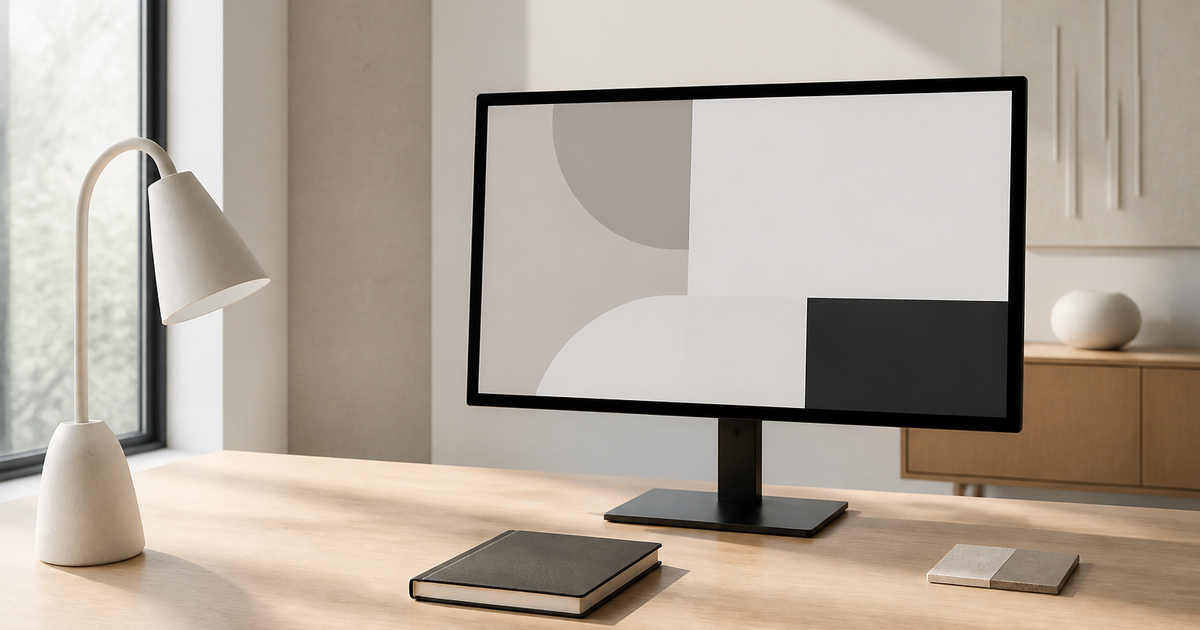
Minimalism works when subtraction makes the offer easier to recognise. Empty space cannot rescue vague positioning, weak content or an interface that hides essential choices.
At StudioDDC, minimalist website design ideas is treated as a way to reduce uncertainty, protect quality and connect every decision to a real need. Aesthetics matter, but they work harder when they also improve reading, maintenance and the team’s ability to explain why the result takes this form. The goal is not to accumulate options, but to build a standard that can be used during briefing, production, review and publishing. Each choice then has context, and the result can evolve without losing coherence.
The difference usually appears when real material enters the project. A long heading, a differently cropped photograph, a person navigating by keyboard or a colleague retrieving a file months later will test every decision. That is why this approach is reviewed beyond the perfect mockup: with complete content, narrow screens, error states and a clear maintenance route. Recording what the team learns prevents the next project from starting at zero and allows the original intention to survive without depending on somebody remembering a conversation. It also improves estimates, clarifies boundaries with clients and separates personal preference from a problem that affects the user. A restrained interface can still have a recognisable voice through type, imagery, proportion and motion. Neutral does not need to mean anonymous.
Three Decisions That Improve the Result
01
Protect the main promise
Decide what visitors must understand first and give that idea enough visual authority. Secondary material should support it rather than compete.
02
Make spacing systematic
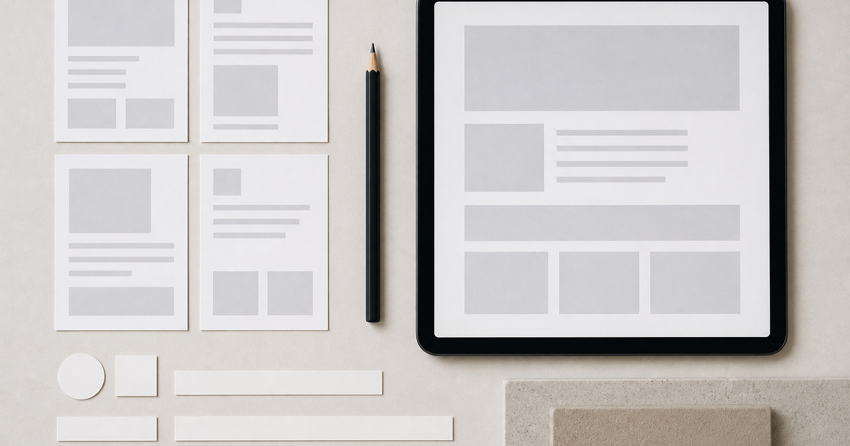
Whitespace feels deliberate when it follows a repeatable scale. Random gaps create fragility and make responsive layouts harder to maintain.
03
Keep useful personality
A restrained interface can still have a recognisable voice through type, imagery, proportion and motion. Neutral does not need to mean anonymous.
From Concept to a Repeatable Method
Minimalism works when subtraction makes the offer easier to recognise. Empty space cannot rescue vague positioning, weak content or an interface that hides essential choices. Decide what visitors must understand first and give that idea enough visual authority. Secondary material should support it rather than compete.
Whitespace feels deliberate when it follows a repeatable scale. Random gaps create fragility and make responsive layouts harder to maintain. A restrained interface can still have a recognisable voice through type, imagery, proportion and motion. Neutral does not need to mean anonymous.
What to Avoid
Removing explanations that users need.
Using pale contrast as a synonym for elegance.
Making every section look identical.
Hiding navigation to create a cleaner header.
The aim is not to impose a recipe, but to remove predictable errors so considered decisions have room to work.
A Practical Five-Step Process
Rank content before removing elements.
Define a spacing and type scale.
Test navigation labels without visual context.
Use one clear action for each decision point.
Review mobile screens for hidden complexity.
This order makes the work reviewable without depending only on impressions. Each step leaves evidence that can be discussed, corrected and reused in the next project.
Frequently Asked Questions
Is minimalist design always faster?
It can reduce visual weight, but performance still depends on implementation, media and scripts.
How much whitespace is too much?
When related information feels disconnected or important content disappears below unnecessary gaps.
Can ecommerce use minimalism?
Yes, if product comparison, pricing, delivery and trust information remain easy to find.
WordPress Developer, Web Designer and Technical SEO Specialist at StudioDDC, focused on Custom WordPress Development, Performance, Accessibility and High-Quality Digital Experiences.












 Small Business Digital Roadmap: Choose the Next Useful Move