Creative Website Moodboard: From References to a Clear Visual Direction
Home » Blog » Branding » Creative Website Moodboard: From References to a Clear Visual Direction
| Didac Soria
PRACTICAL IDEAS
Creative Website Moodboard: From References to a Clear Visual Direction
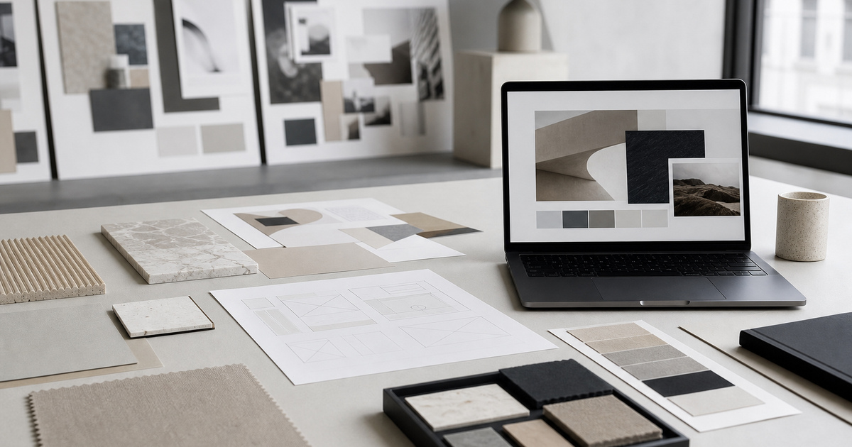
A useful moodboard is a decision-making surface, not a collage assembled to impress. It connects tone, imagery, type, colour and interface behaviour before expensive layout work begins.
At StudioDDC, creative website moodboard is treated as a way to reduce uncertainty, protect quality and connect every decision to a real need. Aesthetics matter, but they work harder when they also improve reading, maintenance and the team’s ability to explain why the result takes this form. The goal is not to accumulate options, but to build a standard that can be used during briefing, production, review and publishing. Each choice then has context, and the result can evolve without losing coherence.
The difference usually appears when real material enters the project. A long heading, a differently cropped photograph, a person navigating by keyboard or a colleague retrieving a file months later will test every decision. That is why this approach is reviewed beyond the perfect mockup: with complete content, narrow screens, error states and a clear maintenance route. Recording what the team learns prevents the next project from starting at zero and allows the original intention to survive without depending on somebody remembering a conversation. It also improves estimates, clarifies boundaries with clients and separates personal preference from a problem that affects the user. Name the spacing, contrast, image treatment and typographic qualities worth carrying into the website. This turns taste into instructions a team can use.
Three Decisions That Improve the Result
01
Start with the brief
Collect references against a real audience, message and commercial objective. A beautiful image that cannot explain a decision is decoration, not direction.
02
Edit more than you collect
A small group of compatible references creates a stronger signal than dozens of unrelated screenshots. Remove anything that introduces a second visual language.
03
Translate references into rules
Name the spacing, contrast, image treatment and typographic qualities worth carrying into the website. This turns taste into instructions a team can use.
From Concept to a Repeatable Method
A useful moodboard is a decision-making surface, not a collage assembled to impress. It connects tone, imagery, type, colour and interface behaviour before expensive layout work begins. Collect references against a real audience, message and commercial objective. A beautiful image that cannot explain a decision is decoration, not direction.
A small group of compatible references creates a stronger signal than dozens of unrelated screenshots. Remove anything that introduces a second visual language. Name the spacing, contrast, image treatment and typographic qualities worth carrying into the website. This turns taste into instructions a team can use.
What to Avoid
Copying a competitor rather than understanding the useful principle.
Using only complete website screenshots.
Mixing luxury, playful and technical signals without hierarchy.
Presenting the board without explaining the decisions.
The aim is not to impose a recipe, but to remove predictable errors so considered decisions have room to work.
A Practical Five-Step Process
Write three words that the finished website should communicate.
Collect references from architecture, publishing and interfaces instead of one source.
Group evidence by colour, typography, imagery and interaction.
Remove references that look attractive but contradict the brief.
Convert the final board into explicit design principles.
This order makes the work reviewable without depending only on impressions. Each step leaves evidence that can be discussed, corrected and reused in the next project.
Frequently Asked Questions
How many references are enough?
Usually fewer than expected. Twelve to twenty carefully chosen fragments are more useful than an endless board because each item can be discussed and defended.
Should a client approve the moodboard?
Yes, but approval should cover direction rather than individual assets. Explain what the board says about tone, hierarchy and behaviour.
Can a moodboard help SEO?
Indirectly. A clearer visual direction supports readable hierarchy, consistent media and a content structure that visitors can understand.
WordPress Developer, Web Designer and Technical SEO Specialist at StudioDDC, focused on Custom WordPress Development, Performance, Accessibility and High-Quality Digital Experiences.












 Mai Slate: Business WordPress Theme